Get my engaging weekly newsletter and your FREE gift, to feel more alive and live your Love in action.
world famous popstar personally advised me on my front cover
You may not believe me when I say that a world famous popstar was the first person to come to me and give me some one-on-one sage advice for my front cover.
But it’s true…because dreams are real and so are the places they inhabit 
Given that this popstar is known for his extreme creativity, it was a most auspicious start for what turned out to be the most magical creative journey with my design, AND a big and very useful reminder about the creative process itself…
It was Robbie Williams who was on stage in a bookstore in my dreams the night I asked for guidance on my cover. He was singing “Let Me Entertain You”.
When he had finished, he jumped down and gave me this advice for the cover: “Be BOLD! Do the opposite of what they’d expect.’’ In that moment I also got the intuitive sense of ‘’red’’.
When I awoke, it was with the realisation that the cover had to be as engaging as the page-turner the book itself is, AND that the image wasn’t to be taken from any of my beautiful sunrise photos I am known for and that many friends had suggested I use.
Months went by.
Still I couldn’t ‘’see’’ what this cover was to be.
Robbie hadn’t been very specific!
When the time came to brief my designer, I knew what I didn’t want. I knew what I liked about other covers. But I had no concrete idea about what my own should look like.
I completed my brief to him as comprehensively as I could and pressed send.
In short, I wanted the cover to:
- Give readers an experience
- Be a thing of beauty
- Draw the reader to the word “One”
- Express the feminine and the masculine, without cliche
- Have a textured and graduated red that symbolised the chaos of events, and the complexity of themes, emotions, and of my writing style in the book.
- Suggest the Divine – whilst appealing to all readers and alienating none.
(In truth this book is as much about the kind of embodied, earthly, and mucky spirituality as it is transcendent spirituality.) - Be clean and uncluttered
- Convey community
- Reveal the heart
- Hint at magic
- Depict the shadow and the light in the story.
The next day I stumbled across an image on the internet.
Or rather, it leapt off the screen at me.
Feeling very stirred by it indeed, I dashed it off to the designer along with a summary of why I thought it could work.
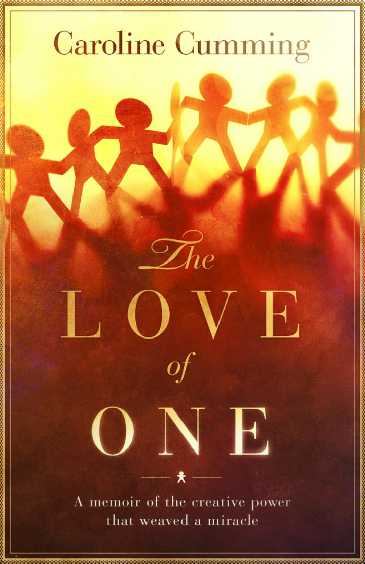
It was obvious he felt the same way because when I got back from my sailing trip around the Whitsundays, he had played around with it, resulting in the image below waiting for me in my inbox…
As I sat with pounding heart, big grin, and silent squeals of delight, I surveyed my first draft of my first ever book.
The more I gazed at it, the more it revealed subtle things about itself to me.
With joy, I saw:
- The way the light filtered through the figures, and how it reminded me of a quote from chapter 10: “In the exposing of the wound a portal had opened, shafting a slither of light from another reality. It was as if this light was the Divine itself, reaching through to hold my hand, inviting me to meet with and embark on a journey I now sensed I was being called to: a journey into Love, into higher forces, and into surrender.”
- How the shadows at the feet of the figures so brilliantly represented the element of psychological shadow in the book, and also the literal references to shadows in the book.
- The dance of the human divine throughout the story.
- How the paper-chain people not only represented community, the power of being held and of holding space, and the truth that separation is an illusion, but alsovery neatly symbolised the fact that unconditional love IS a‘’creative’’ power – one that gives birth to and receives back into itself, all manifested things.
- How perfectly the font indicated the feminine aspect of the book and the story; its fluid events, and the qualities of compassion, intuition, flow, empathy, surrender, and nurturing that all took place in the narrative.
Then I realised something very cool.
The lattice effect at the feet of the figures was like a matrix – just like the online group heart that formed across the ether for Gordon, and just like the matrix that had given rise to the experiences in the book of multiple and parallel realities.
As I made these connections, something had me look up in that moment and over to my bookcase.
The first book I clapped eyes on was one by Gregg Braden: ‘’The Divine Matrix: Bridging Time, Space, Miracles, and Belief.”
Eyes widening, I fetched the book and turned it over to read the back.
The sentence that jumped out gave me goose-bumps:
“are the miracles that we see in the quantum world actually showing us our greatest possibilities rather than our scientific limits? Could the spontaneous healing of disease, an instant connection with everyone and everything, and even time travel, be our true heritage in the universe?”
I glanced back in wonder at the draft for my cover.
Suddenly I spied something else that had not been obvious when I first sent the base image to the designer…
WOW. The hidden hearts!
They had been there all this time, now emerging before my eyes from in-between the linked arms of the figures! Bypassing the conscious mind, to land in the readers heart like magic!
The heart is a major symbol in the book, not only with Gordon’s physical heart failure and the need to get his heart beating properly again, but also there is the emotional heart, the heart that is our ‘’essence’’ in the world, and the group heart that was the healing community for him.
Could it get any more magical?
Apparently, yes.
The next day, I completed some final editing on the last chapter.
That’s when I saw it.
A line that I had always known was in the book, but that I had not consciously considered when I had prepared the brief and sent the base image to the designer.
A line that had poured through me and my fingertips back then.
A line that now 100% described the main visual image on my front cover!
Staring in disbelief, I re-read it.
The clue to my front cover had been sitting there all that time, waiting for the design-story to come full circle and affirm my intuitive process so far!
So there you have it.
The birth of a front cover.
Via the same kind of magic that weaved a miracle with my husband.
In other words: via the creative power of LOVE.
And including of course, a nudge from Robbie Williams 😉
So what did I learn – or remember – during the whole process?
That our visions and creations have a life force of their own. They will show us who and what they are to be, and how they wish to unfold. All we need do is stay open to the messages, the messengers, and the moments that will help bring them all through


